
Setting The Mood: Logo + Branding Reveal
One of the questions I get asked most often is:
"Where do you start when you're building a brand?"
For me, the answer isn't with a logo.
It's with a feeling.
In this episode, I take you behind the scenes of creating the brand identity for Fever Dream Apparel—from the first Pinterest inspiration to the final logo suite, clothing labels, and mood board.
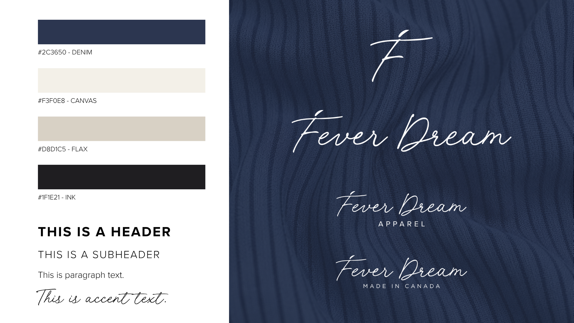
Because branding is such a visual process, I've included all of the assets referenced in the episode throughout this article.
Your Logo Isn't Your Brand
Before we dive into the visuals, there's one thing I always tell my clients:
Your logo is not your brand.
A logo alone won't make your business memorable.
What creates a strong brand is consistency—how your business looks, feels, communicates, and shows up every single time someone interacts with it.
In fact, my very first business had a logo I quickly threw together in Photoshop with almost no strategy behind it. It certainly wasn't award-winning, but through consistent application and a great customer experience, it became part of a successful seven-figure business.
The lesson?
A logo is only one piece of the puzzle.
Defining the Direction
Before designing anything, I spent time thinking about the personality of Fever Dream Apparel.
I wanted the brand to feel:
Effortless
Creative
Relaxed
Premium without feeling pretentious
Soft, flowing, and expressive
Those qualities became the filter for every design decision that followed.
Finding Inspiration
Whenever I start a branding project, I collect inspiration before I design.
That inspiration can include:
Editorial layouts
Typography
Fashion photography
Colour palettes
Textures
Packaging
Lifestyle imagery
The goal isn't to copy anything.
It's to identify a consistent visual language that captures the feeling I want people to experience.
Choosing the Typography
Typography became one of the biggest decisions for this brand.
Normally, I avoid script fonts.
But Fever Dream called for something different.
The name itself felt soft, expressive, and a little whimsical, so I explored dozens of typefaces until one immediately felt right.
Sometimes the best design decisions come from choosing what suits the brand—not necessarily what suits your personal preferences.
Evolving the Logo
Once I had the typography, I realized something interesting.
The capital F almost resembled the silhouette of a person in motion.
That tiny detail sparked the entire logo concept.
Because illustration isn't my specialty, I partnered with one of my trusted graphic designers to refine the idea.
Together we created:
Primary wordmark
Standalone icon
Fever Dream Apparel lockup
"Made in Canada" variation
Most importantly, everything was built as professional vector artwork so it can be used everywhere—from clothing labels to embroidery and large-format printing.
Final Logo Suite
Having multiple logo variations makes it much easier to apply the brand consistently across different platforms and products.
Rather than stretching one logo to fit every situation, each version has a purpose.
Why I Always Create Mood Boards
If there's one branding tool I recommend more than almost anything else, it's a mood board.
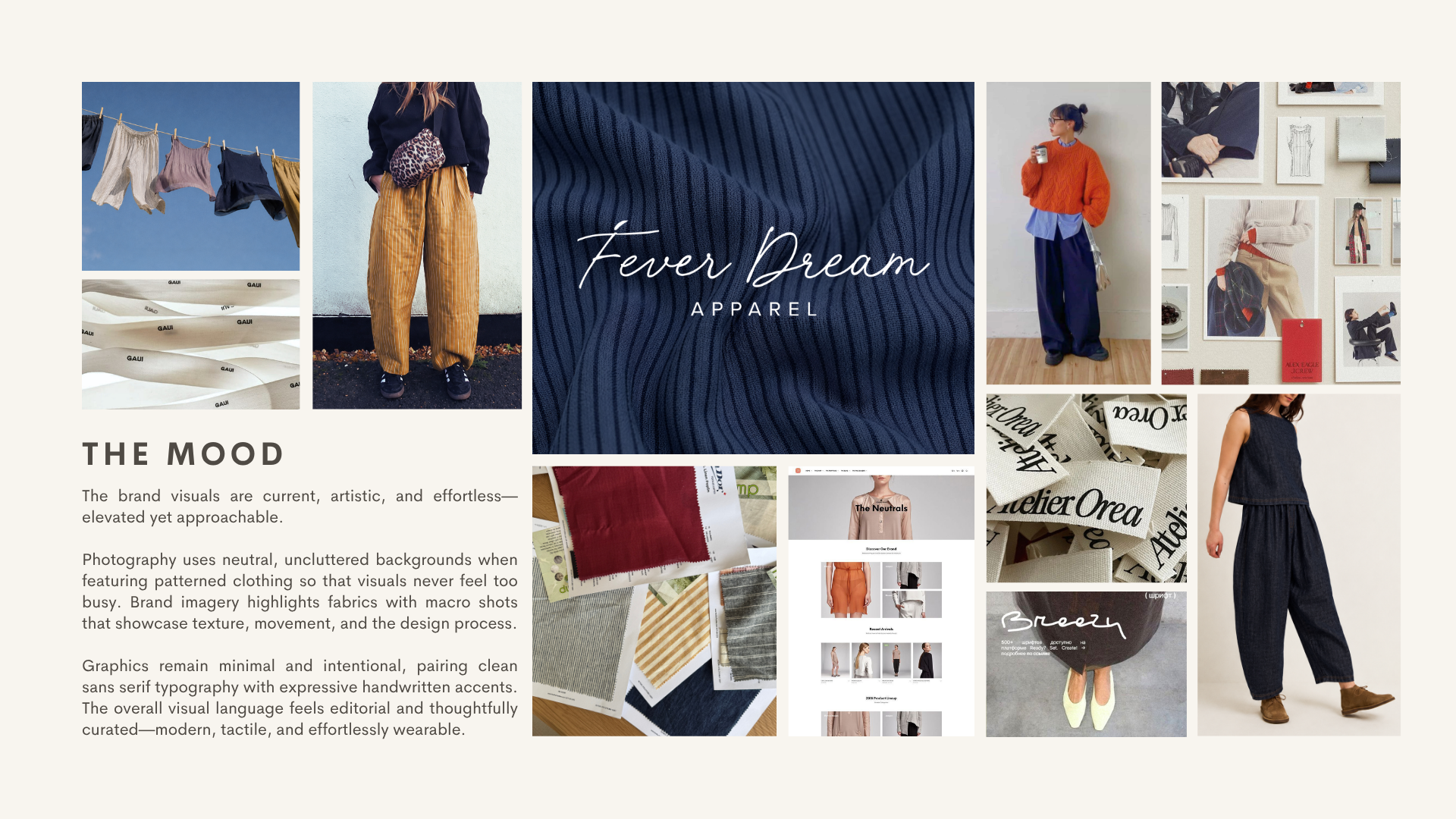
A mood board is much more than a collage of pretty images.
It's a visual guide that captures the atmosphere of your brand.
Mine includes inspiration for:
Photography style
Colours
Typography
Materials
Fashion styling
Textures
Layouts
Overall mood
Whenever I'm designing something new—whether it's a website, social media graphic, packaging concept, or product photoshoot—I can come back to this board and ask one simple question:
"Does this still feel like Fever Dream?"
If the answer is yes, I know I'm building consistency.
Branding Doesn't Have to Cost Thousands
One thing I wanted this series to demonstrate is that you don't always need an enormous branding budget.
For this project, I combined:
My own branding strategy and creative direction
A graphic designer to refine the logo
A designer to create the mood board
The contractor costs were only a few hundred dollars, but because the vision was already clear, every dollar worked much harder.
My Advice if You're Branding on a Budget
If you're creating a brand yourself, keep it simple.
Focus less on creating something flashy and more on creating something consistent.
A strong brand doesn't come from adding more.
It comes from repeating the right elements over and over again.
That means:
Choose typography intentionally.
Limit your colour palette.
Build a mood board before designing.
Create consistent imagery.
Apply your brand consistently across every customer touchpoint.
People don't remember complexity.
They remember consistency.
What's Next?
With the branding complete, it's finally time to start bringing Fever Dream Apparel into the real world.
Next up, I'll be diving into product development, sourcing, and turning this visual identity into an actual clothing collection.